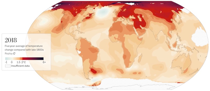
The Washington Post has some very detailed and comprehensive articles you should check out. As an example one is Titled “Dangerous new hot zones are spreading around the world”. It goes into considerable detail regarding the emergence of areas of our planet that are already over 1.5C and even over 2C warmer.
It is part of the series that they have run under the banner of “2C: Beyond the Limit”. Other articles in that same series, also well-worth investing some time reading, include …
- Aug 2019 – Extreme climate change has arrived in America
- Sep 2019 – Dangerous new hot zones are spreading around the world
- Oct 2019 – Radical warming in Siberia leaves millions on unstable ground
- Oct 2019 – Facing unbearable heat, Qatar has begun to air-condition the outdoors
- Oct 2019 – The ice used to protect them. Now their island is crumbling into the sea
- Nov 2019 – The climate chain reaction that threatens the heart of the Pacific
- Nov 2019 – A crisis in the water is decimating this once-booming fishing town
- Nov 2019 – The climate chain reaction that threatens the heart of the Pacific
- Dec 2019 – Fires, floods and free parking: California’s unending fight against climate change
- Dec 2019 – Facing catastrophic climate change, they still can’t quit Big Oil
- Dec 2019 – How we know global warming is real
- Dec 2019 – On land, Australia’s rising heat is ‘apocalyptic.’ In the ocean, it’s worse
- Dec 2019 – Lives adrift in a warming world
Why highlight these?
The photography is stunning, and the writing is captivating.
Beyond that, this is journalism as it should be when it comes to a deep look at what Climate Change is doing. It is not graphs and numbers, but rather is about the impact upon individuals.
It does however make you wonder just how robust the science behind it all really is, so I picked one for a closer look.
Dangerous new hot zones are spreading around the world
Is this article being overly dramatic, and are the authors simply hyping things up because they have a specific political bias, or is there data that backs it up.
Let’s take a look.
Foundational Claim: The entire globe is warming, but some parts are changing much faster than others. Numerous locations around the globe have warmed by at least 2 degrees Celsius over the past century. That’s beyond the 2C red line.
The data sets
Behind it all are four data sets. These are from NASA, NOAA, Berkeley Earth and the scholars Kevin Cowtan and Robert Way (because their data set includes more extensive coverage of the Arctic than the U.K. Hadley Center’s data set).
Each data set divides the globe into a grid of cells and provides a series of monthly temperature observations for each, going back to the 19th century.
What gets compared to what?
For the NASA and NOAA data sets, which date back to 1880, they used the 20-year period from 1880 to 1899. The Berkeley Earth and Cowtan and Way data sets go back to 1850, so they used the 1850-1899 period as a second baseline.
We then calculated how much the annual temperature average for each subsequent year differed from the two preindustrial baseline averages. These departures from the average are referred to as “temperature anomalies” by climate scientists.
Next, we sought to capture the current climate. To do so, we averaged several years of recent temperature anomalies together to account for weather and natural climate variability, using both five-year and 10-year periods. The maps show averages of the most recent five years (2014 to 2018) using data from Berkeley Earth. We then calculated the percentage of the globe’s area that exceeded a rise of 2 degrees Celsius (3.6 degrees Fahrenheit). For mapping purposes, the resolution of the data was increased using bilinear interpolation.
Their Results
What about the Uruguay hot spot?
Their method allowed them to analyze how the hot spot off the coasts of Uruguay and Argentina varies in its level of warming depending on the different scenarios considered. In all the data sets, at least part of the hot spot exceeds 2C when 2014-2018 is compared with 1880-1899. Linear trends beginning in 1880 and 1895 also often detect 2C of warming in the region.
Summary
The science behind the article consists of not just one data set, but multiple independent sources. It is robust and fact-based.
Thermometers are neither left-wing nor right-wing, they simply record data.
If we opt to ignore it and not believe it, then we are doing so at our own peril.
