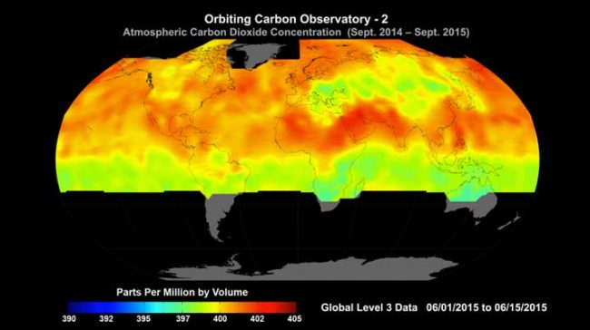
The TL;DR; (Too Long; Didn’t Read) answer is …yes, we can model how it flows.
Using data gathered via NASA’s Orbiting Carbon Observatory (OCO-2) satellite, a 3D flow model has been developed. Visualising data like this not only enables us to see and grasp what is happening, but to also potentially predict where concentrations of carbon dioxide could be especially high or low, based on activity on the ground.
Below is a short YouTube clip that has been published by NASA. It specifically models the behavior of carbon in the atmosphere from Sept. 1, 2014, to Aug. 31, 2015 and uses the actual measurements to do so.
The colours are used to model different CO2 concentrations. Deep blue is 390 PPM and deep red is 408 PPM. I find it rather interesting to observe that most of the red is focused within the northern region over the arctic where the rate of warming has been twice that of the global average.
More Details from NASA
The webpage all about it contains more details. There they explain that they have used their supercomputing facilities to combine the data measurements that have been gathered with a sophisticated Earth system model to provide one of the most realistic views yet of how this critical greenhouse gas moves through the atmosphere.
The news update on the NASA website that describes it all, explains what is driving the creation of such 3D models…
Scientists know that nearly half of all human-caused emissions are absorbed by the land and ocean. The current understanding is that about 50 percent of emissions remain in the atmosphere, about 25 percent are absorbed by vegetation on the land, and about 25 percent are absorbed by the ocean. However, those seemingly simple numbers leave scientists with critical and complex questions: Which ecosystems, especially on land, are absorbing what amounts of carbon dioxide? Perhaps most significantly, as emissions keep rising, will the land and the ocean continue this rate of absorption, or reach a point of saturation?
The new dataset is a step toward answering those questions, explained Lesley Ott, a carbon cycle scientist at NASA Goddard and a member of the OCO-2 science team. Scientists need to understand the processes driving the “carbon flux” – the exchange of carbon dioxide among the atmosphere, land and ocean, Ott said.
“We can’t measure the flux directly at high resolution across the entire globe,” she said. “We are trying to build the tools needed to provide an accurate picture of what’s happening in the atmosphere and translating that to an accurate picture of what’s going on with the flux. There’s still a long way to go, but this is a really important and necessary step in that chain of discoveries about carbon dioxide.”
Data Assimilation
Each and every day the OCO-2 satellite gathers about 100,000 carbon dioxide estimates. What is impressive here is that they have been able to render that vast lake of daily data into a visual representation that illustrates how the CO2 flows.
What does “Data assimilation” mean?
“Data assimilation is the process of blending model simulations with real world measurements with the precision, resolution and coverage needed to reflect our best understanding of the exchange of carbon dioxide between the surface and atmosphere,” – Brad Weir, a researcher based in the GMAO (Global Modeling and Assimilation Office)
What can now be seen via the visualisation is …
The rise and fall of carbon dioxide in the Northern Hemisphere throughout a year; the influence of continents, mountain ranges and ocean currents on weather patterns and therefore carbon dioxide movement; the regional influence of highly active photosynthesis in places like the Corn Belt in the U.S.
What next?
Basically the next step will be enhancements to the model itself. The plan is to inject a more complex biology module so that a better understanding of the impact of the various ecosystems can be gained. Plant life absorbs CO2, hence understanding the impact of forested regions will reveal an even deeper understanding.
Why the Press Release?
Its a message not just for the public, but specifically for the Trump administration. Since they have a declared intent to gut NASA of all its climate research work, it has become rather important to showcase it and explain the immense value that will soon be gone.
Everything that they have spent years pulling together will be lost …
The results highlighted here demonstrate the value of NASA’s unique capabilities in observing and modeling Earth. It also emphasizes the collaboration among NASA centers and the value of powerful supercomputing. The assimilation was created using a model called the Goddard Earth Observing System Model-Version 5 (GEOS-5), which was run by the Discover supercomputer cluster at Goddard’s NASA Center for Climate Simulation.
“It’s taken us many years to pull it all together,” Pawson said. “The level of detail included in this dataset gives us a lot of optimism that our models and observations are beginning to give a coherent view of the carbon cycle.”